A complete brand system for a premium botanical skincare label — from identity to packaging to editorial campaign direction.
ScopeBrand Identity
ScopePackaging Design
ScopeArt Direction
TypeFictional Brand
01
Brand Concept
Where rigour meets the wild
GROVE is a direct-to-consumer botanical skincare brand targeting urban professionals who demand both clinical transparency and considered design. The brief: build a brand system that lives between the lab and the forest — precise, confident, and quietly beautiful.
The name "Grove" anchors the brand in something grounded and alive — not a single plant or ingredient, but an entire ecosystem. The identity reflects that: structured but organic, scientific but warm.
Positioning
Premium efficacy
High-performance formulas, no apologies for the price point. Every design choice signals quality before the customer reads a word.
Audience
The informed consumer
28–42, urban, ingredient-literate. They read labels, distrust greenwashing, and buy design the way they buy product quality.
Tone
Quiet authority
No wellness buzzwords. No apothecary pastiche. Grove speaks plainly and confidently — like a scientist who also happens to have taste.
02
Visual Identity
The wordmark
The logo is a pure wordmark — no mark, no icon. GROVE in Syne 800, tracked tight, all caps. The letterforms carry enough weight and personality on their own. Subtext is set in ultra-wide tracking, acting as a quiet counterpoint to the compressed headline.
GROVE
Botanical Skincare
→ Replace this with generated logo file once finalized
GROVE
Primary / Forest
GROVE
Brand / Sage
GROVE
Light / Cream
03
Color Palette
Forest, stone, bronze
Four primaries and two accents. The palette reads as natural but not rustic — deep forest anchors authority, sage gives life, cream provides warmth, and bronze adds a precise editorial edge.
Forest Deep
#0D1C12
Grove Sage
#4A7A58
Warm Cream
#F2EDE4
Bronze Accent
#9A7230
Sage tints · 10–100%
10%
25%
50%
75%
100%
04
Typography
Two voices, one system
Syne 800 carries the brand voice — campaign headlines, wordmark, section labels. Instrument Sans handles everything functional — ingredient lists, body copy, UI text. Together they balance expression with legibility.
Syne
Display / Headlines / Wordmark
800The skin remembers everything
700Formulated with intention
400Botanical extracts, clinical results
Scale — brand materials
CampaignGROVE
H1 · 32pxBotanical Skincare
Body · 16pxCold-pressed, batch-tested, made to last.
Label · 11px30ml · Batch 2401 · Made in NL
05
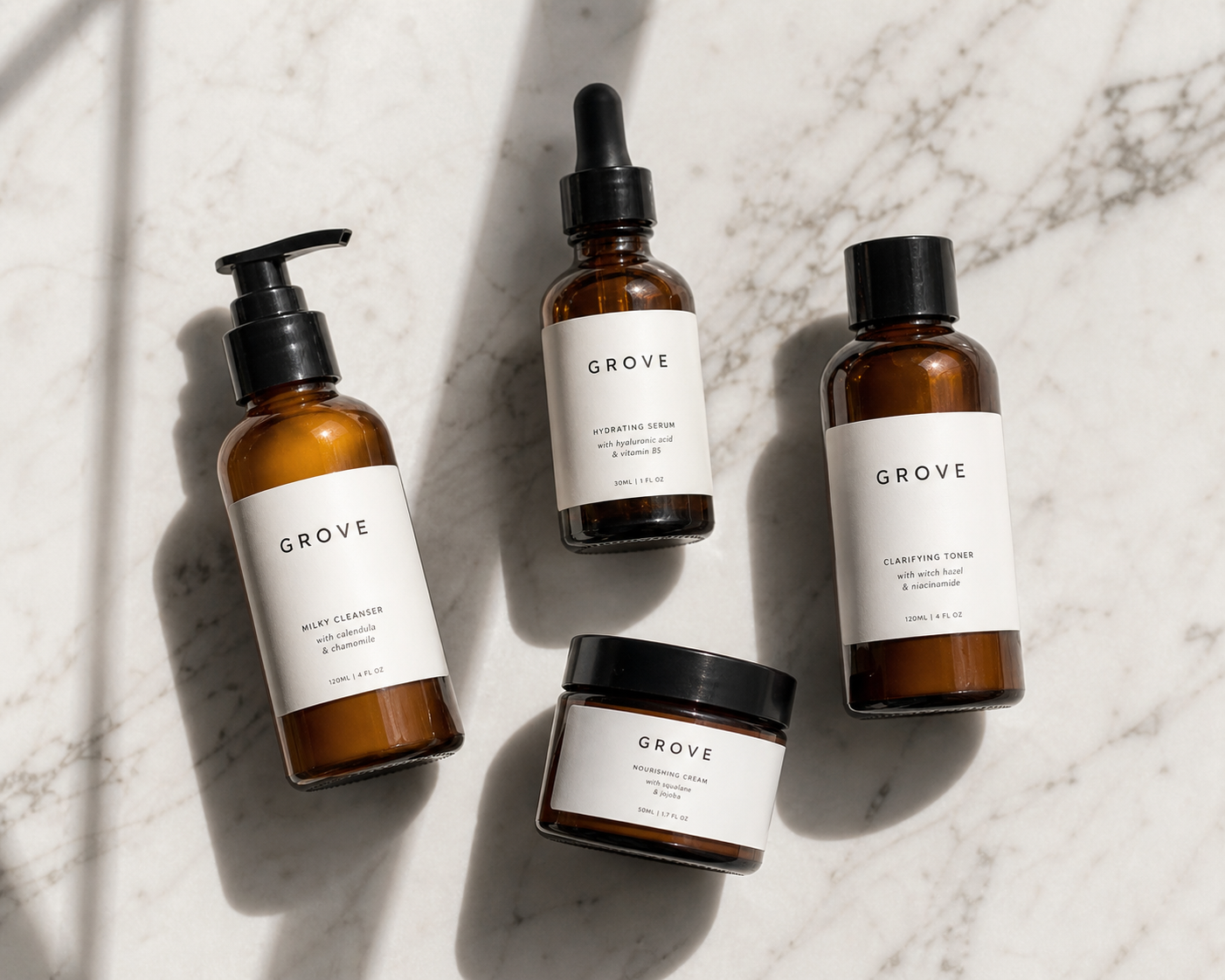
Packaging System
The product line
Four SKUs at launch: Serum, Facial Mist, Toner, and Balm. All share the same label architecture — wordmark top-aligned, product name in small-tracked caps, volume bottom-right. Amber glass across the line; matte white labels with blind-embossed type where budget allows.
GroveSerum30ml
Serum
GroveMist100ml
Facial Mist
GroveToner150ml
Toner
GroveBalm50ml
Balm
CSS-rendered product lineup — replace with photography when ready
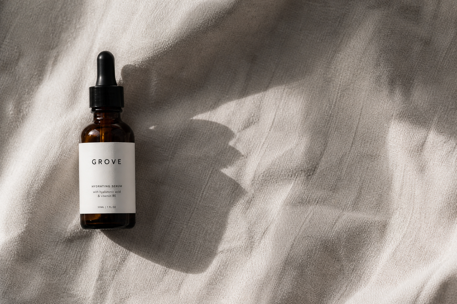
The campaign lives between studio precision and natural texture. Products shot on white stone or raw linen; ingredients in macro; skin in natural light with no retouching. Copy is declarative. Headlines are never more than four words.
Photography
Studio + texture
Products on matte stone or raw linen surfaces. No props. Directional natural light, minimal fill. Shadows are visible and intentional.
Copy tone
Four-word headlines
"The skin remembers everything." No superlatives. No wellness speak. Statements that feel like findings, not promises.
Colour grading
Cool-warm duality
Forest greens in the ambient; warm amber in the product highlights. Skin tones are slightly desaturated — clinical, not beauty-filtered.
Composition
Generous negative space
60–70% of the frame is air. Products are never centred — always offset, creating tension and editorial sophistication.
Still lifeNatural lightMacro ingredientsEditorialNo retouchingDeclarative copyOffset composition
Campaign hero — Hydrating Serum · 30ml
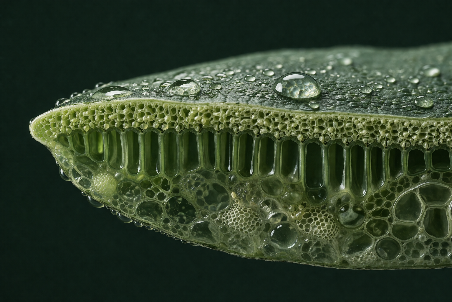
Ingredient macro — botanical cell structure
Skin in natural light — no retouching
07
Outcomes
What was built
01
Complete brand system across identity, packaging, and campaign
02
4-SKU packaging system on a unified label architecture
03
Art direction guide ready for shoot briefing and production