 A PUOI Studio product · Product ownership · 0→1 · 2026
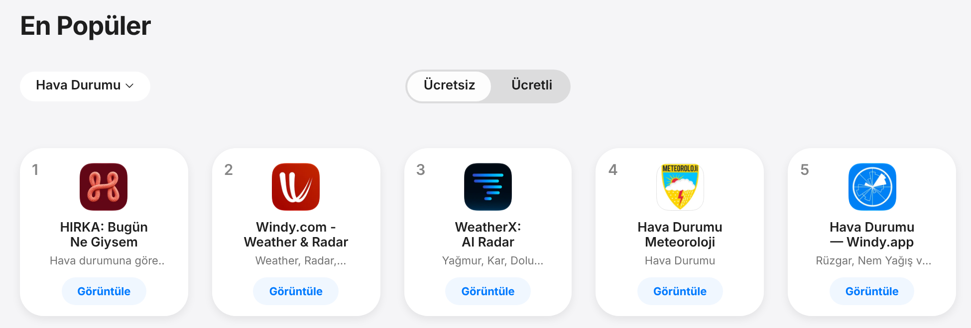
From a viral Reel to #1 in Weather on the App Store in Türkiye
A weather app that tells you what to wear instead of the temperature. I co-founded HIRKA and own the product: I validated the idea in my own audience, set the scope and priorities, made the product calls with data, and designed the experience, brand and growth system. My co-founder built it.
Results
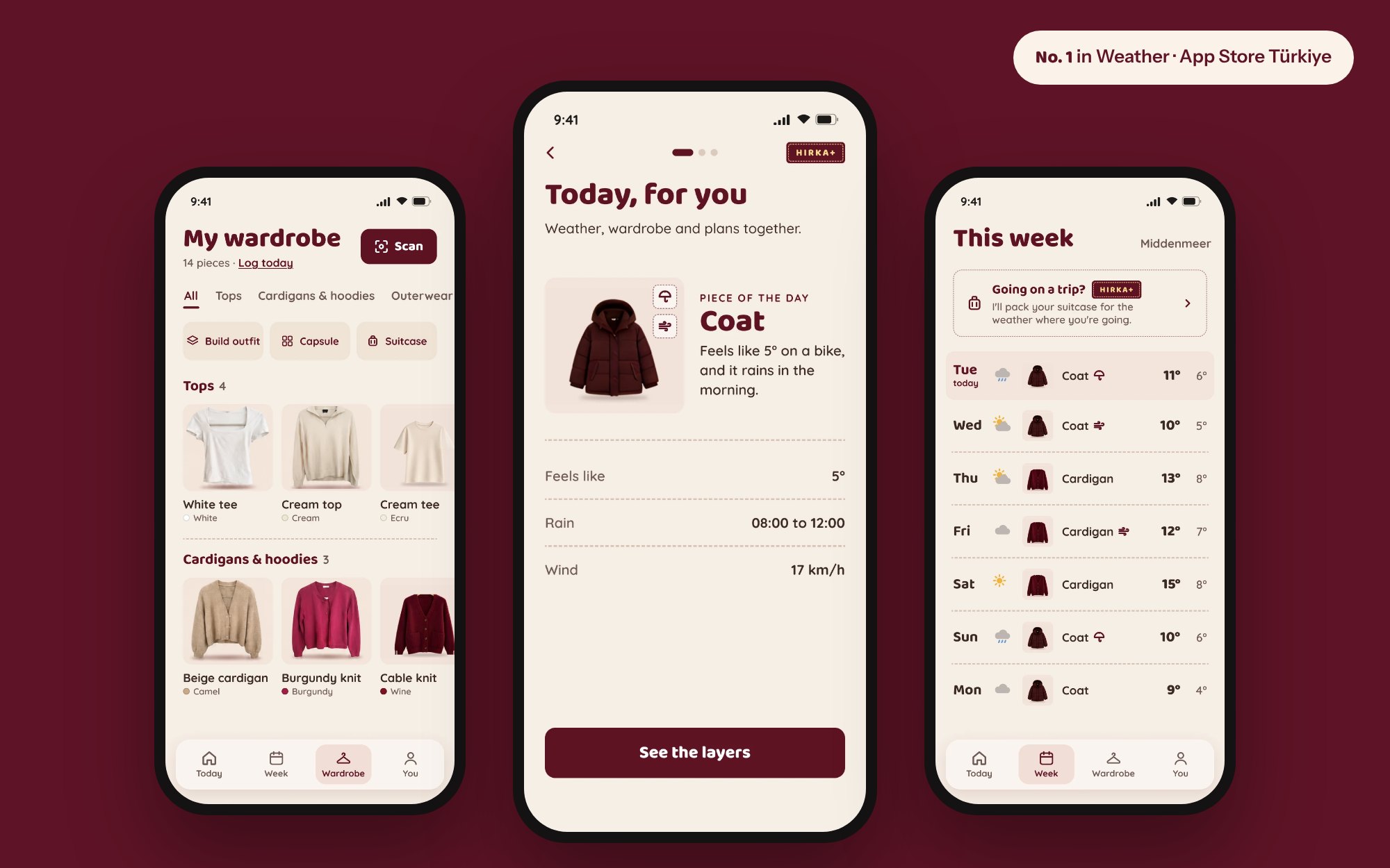
What happened in the first two weeks
Also top 10 in Weather on the App Store in Cyprus (#3), Austria (#4), Bulgaria (#4), Belgium (#7) and Germany (#10) on 9 November 2026, and #1 in Weather on Google Play in Iran (AppBrain). Live in 11 languages within three weeks of launch, and 96% of new users finish onboarding.
The problem
Weather apps give you numbers. People need a decision.
"14°C, feels like 11" does not answer the question you have at the door: cardigan or coat? Turkish mothers have answered that question in one sentence for generations.
"Take your cardigan."
Discovery
Validated before a single screen existed
I posted a Reel on my Instagram about a weather app run by a Turkish mother. It went viral, and the comments filled up with the same two requests: "If only this were an app" and "Tell me when it's out."
That gave me three things a product team usually has to work for: proof of demand, the exact words users would use to describe the product, and a waiting audience for launch day. HIRKA (Turkish for cardigan) became that one sentence, as an app.
My role
What I owned as Product Owner
Product and backlog
- Roadmap, backlog and feature specs
- Priorities set from user feedback and analytics
- Build reviews and numbered fix lists for engineering
- Screen sign-off before every release
Strategy and monetisation
- Positioning: a decision, not a degree
- Free versus premium split and paywall moments
- Pricing test plan and retention loops
- Store listing and screenshots
Design
- UX/UI for 56 screens and the design system
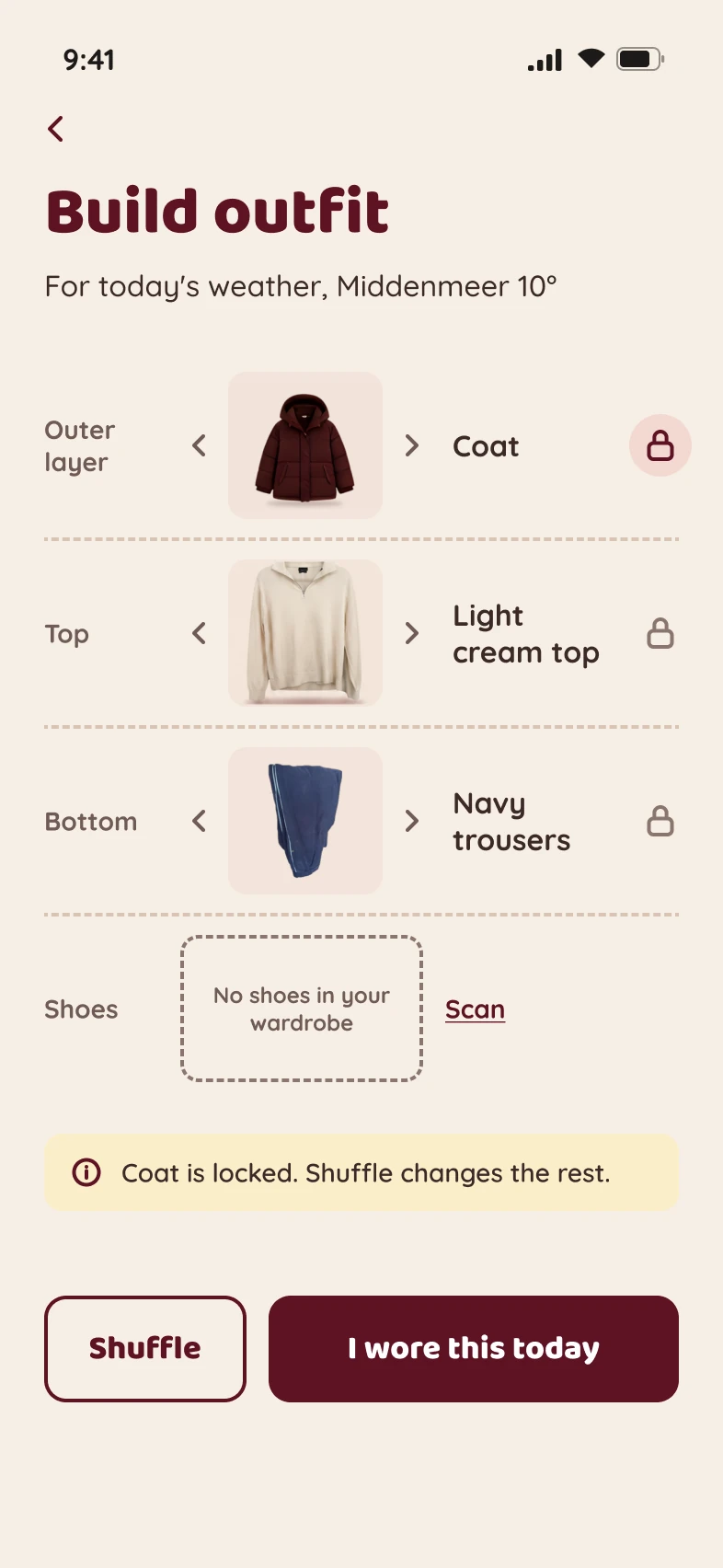
- Onboarding and the wardrobe scanning flow
- Turkish UX writing
- Written developer handoff
Brand and growth
- Mascot character, voice and tone rules
- Launch from my own audience, then a dedicated @hirka.app account
- Faceless Reels series and multilingual content strategy
- Influencer evaluation
Delivery
Scoped to ship fast
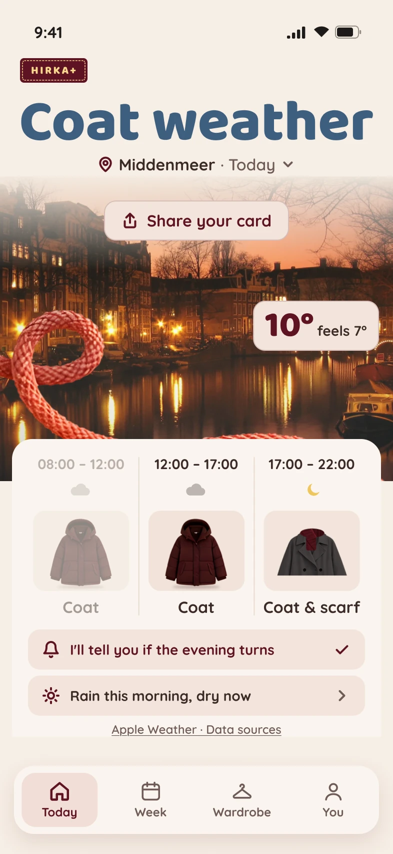
No ad budget, no marketing team, two people. The first version had to do one thing well: answer "what do I wear today?" for morning, noon and evening. Everything else went to the backlog.
- 13 OctFirst commit
- 25 OctLive on the App Store, after making sign-in optional to pass Apple review
- 31 OctLive on Google Play
- 3 Nov#1 in Weather in Türkiye and a record day of 8,000+ installs, with both stores live
- By week 3Live in 11 languages
Key decisions
The product calls behind the numbers
Show the decision, not the data
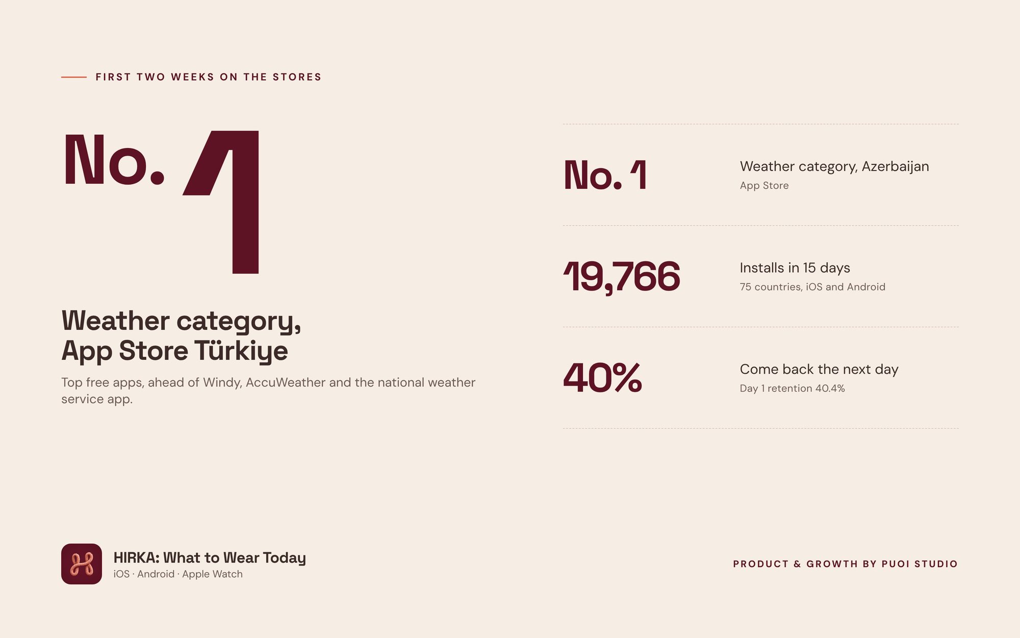
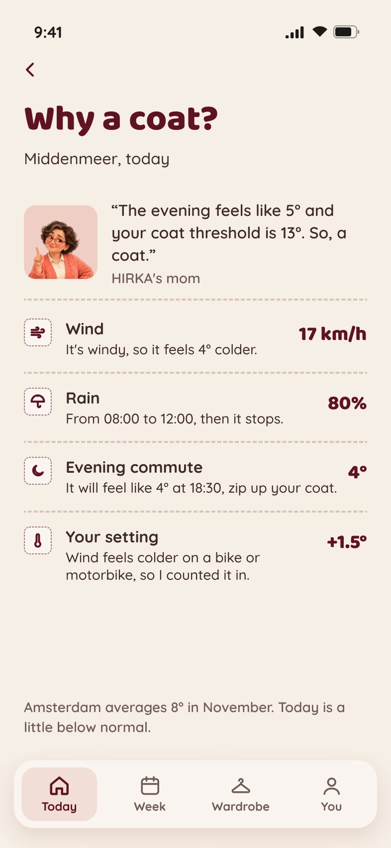
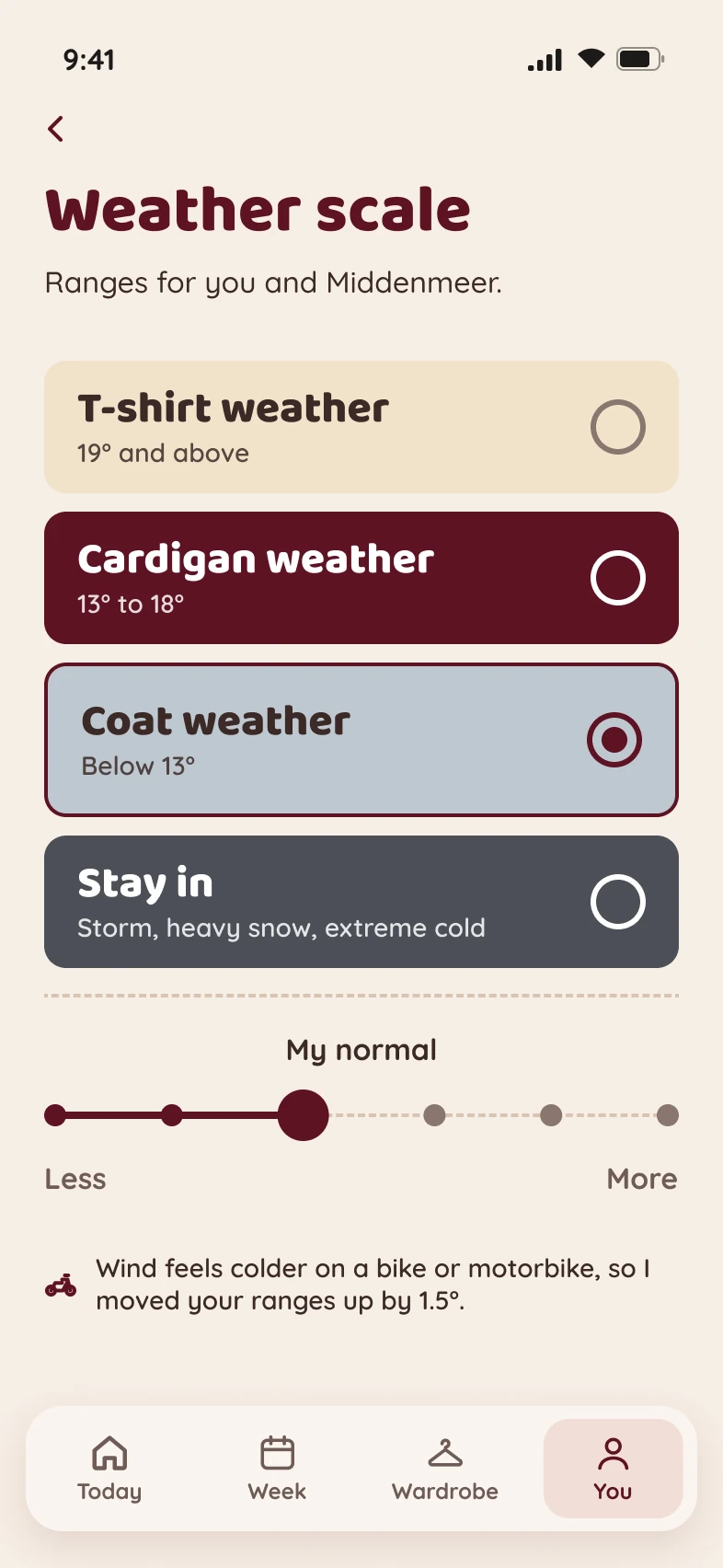
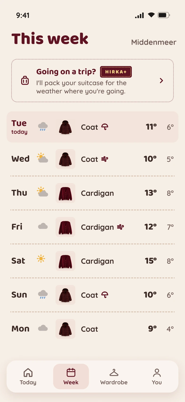
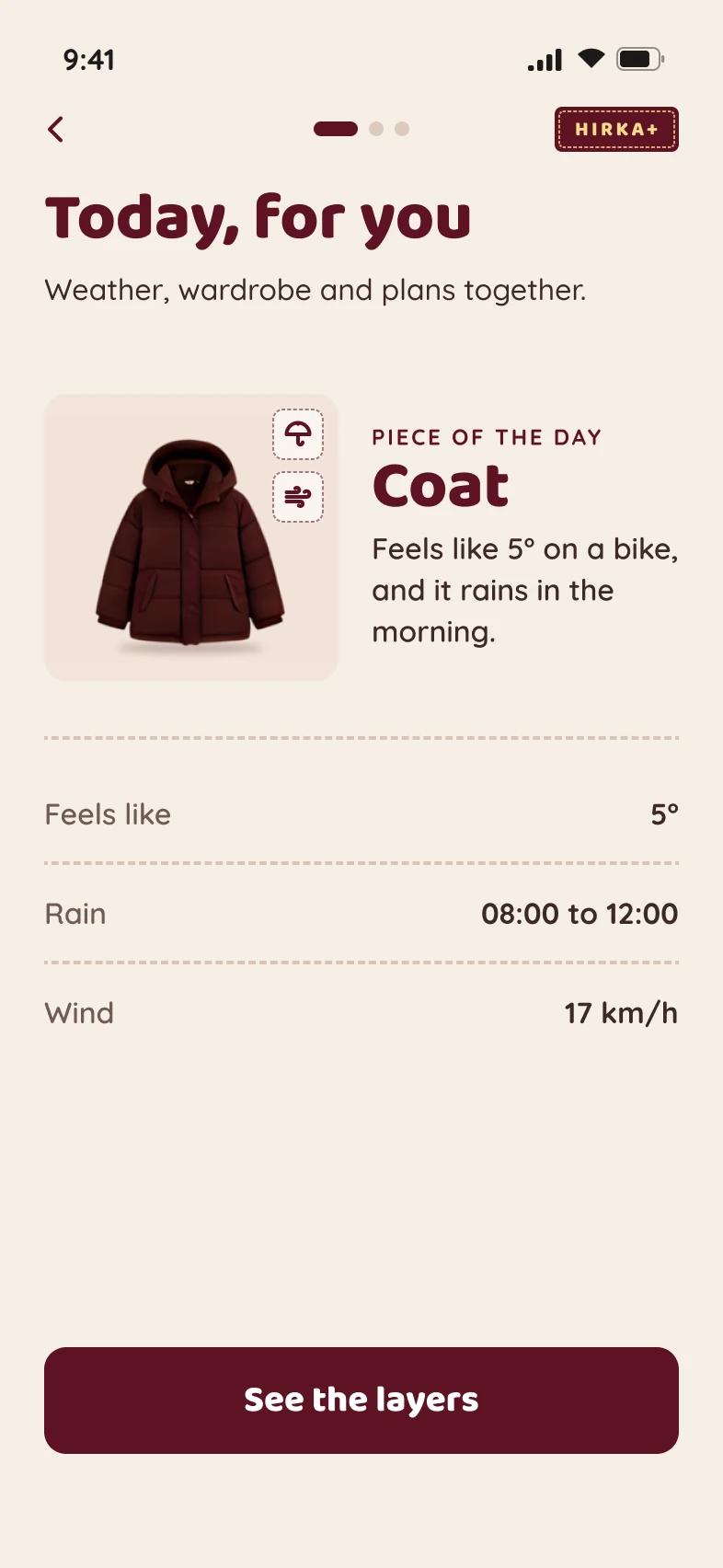
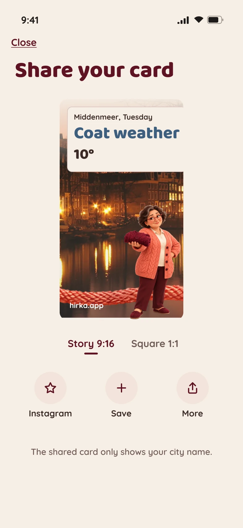
The home screen leads with one verdict: T-shirt weather, Cardigan weather, Coat weather or Stay in. Morning, noon and evening each get their own outfit, because the walk home is often colder than the walk out. Thresholds adapt to location, and "Why a coat?" shows the reasoning: wind, rain, the evening drop and your own setting.
Learn from the user instead of guessing
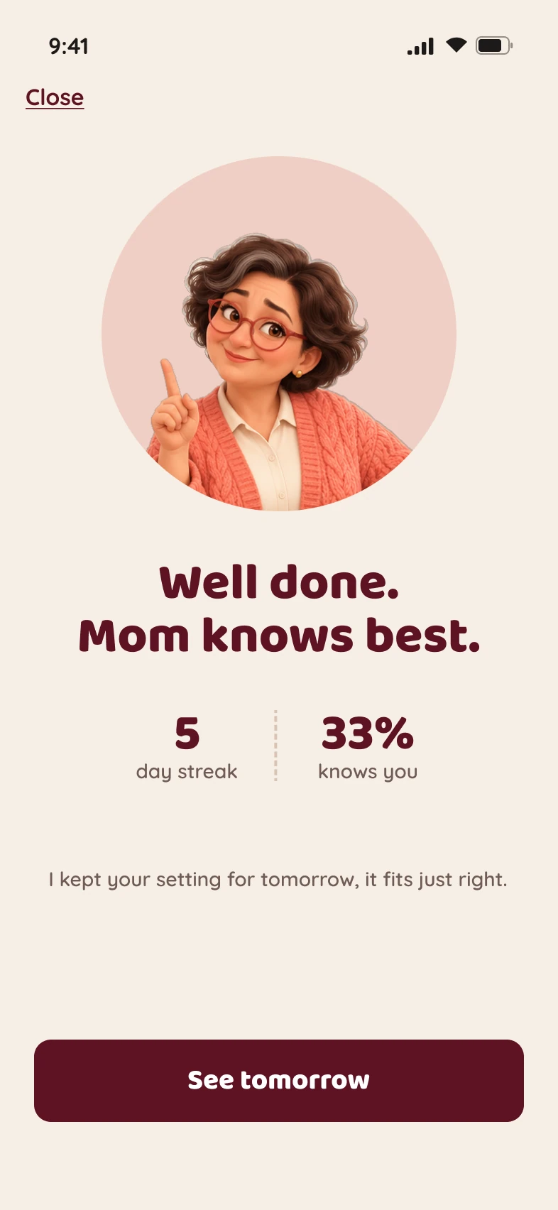
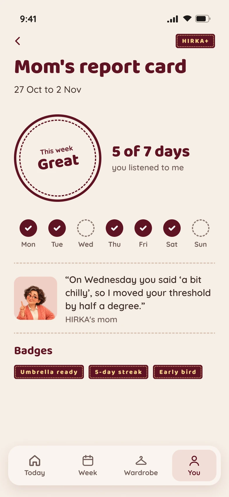
A short evening check-in asks two questions: "Did you wear what I said?" and "How did it feel?" The answers tune a personal cold-sensitivity setting, so the same 15°C can mean a T-shirt for one person and a coat for another. I deliberately left out wear counters and automatic outfit guessing: logging is optional, one tap, and never nags. 4,500+ people answered the evening question in the first two weeks, and a weekly report card closes the loop.
Value before permission
In the redesign I reordered onboarding into seven steps so people see a real outfit decision for their own location on step 3, before the app asks for notification permission. They grant permission after they have seen why it is worth it.
A free core, an honest premium
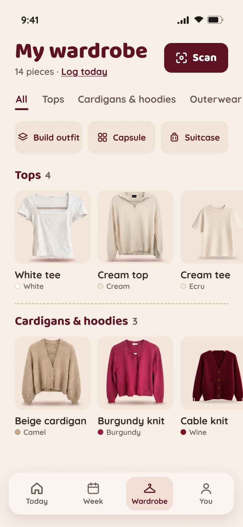
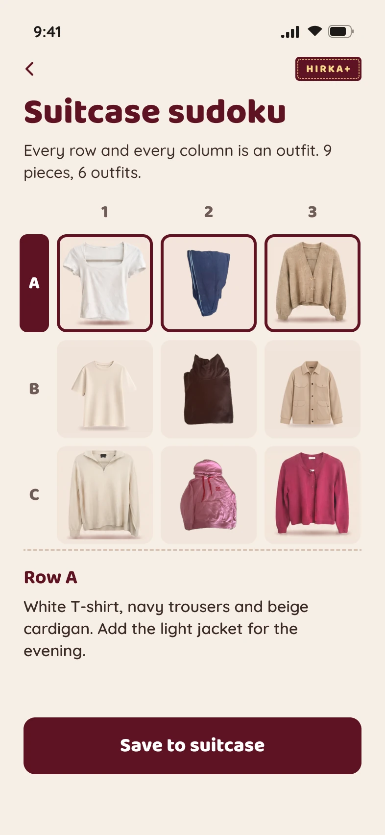
Early on, the evening forecast sat behind HIRKA+. A user's DM showed it read as withholding basic weather, so I reversed it and the evening forecast stays free. Premium moved to proactive and personal value instead: your own wardrobe, outfits built from it, layer plans and packing lists. When a user publicly called the paid tier a cash grab, I answered openly and explained the real costs behind it.
Distribution designed in
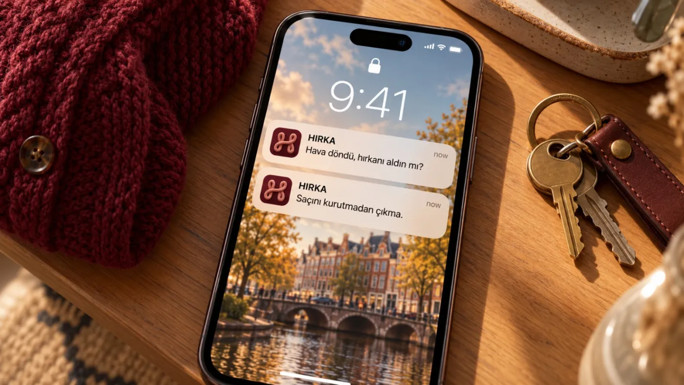
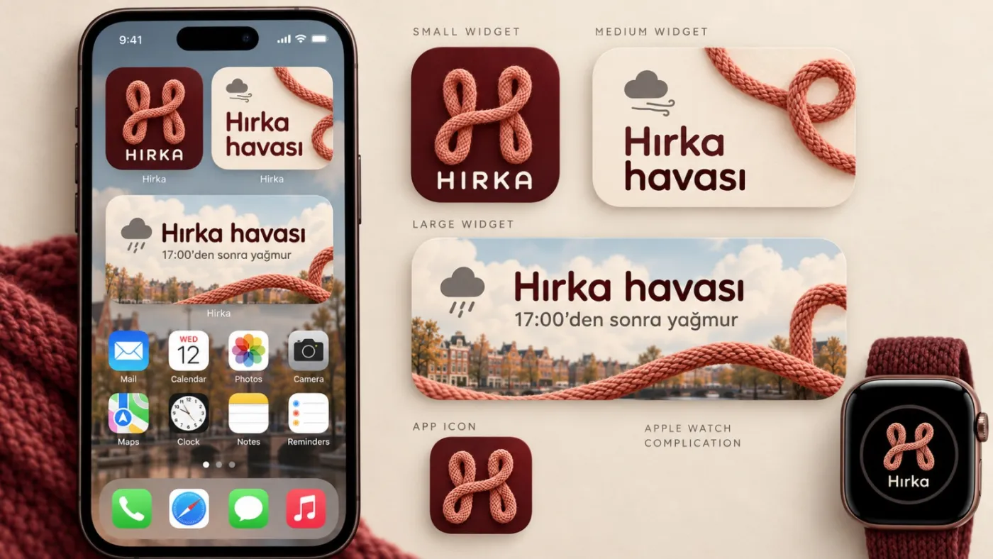
Growth was part of the product scope: a shareable daily outfit card, widgets and an Apple Watch complication that answer without opening the app, one smart link that sends each phone to the right store, and a dedicated @hirka.app account with daily weather cards. For the move to 11 languages I created the series "Every mother has a cardigan sentence", one account and one character, with each episode showing how mothers in another country say it. 21% of installs have opened the app straight from a notification.
Data over opinion
Who buys HIRKA+, and why?
Two weeks into the launch I ran a full analysis of buyer behaviour. My first report had recommended moving some premium features to the free tier. The data showed that those were exactly the features people paid for, so I changed my recommendation.
The question
Who buys HIRKA+, what made them buy, and what do they use afterwards?
The method
I followed every buyer's path before and after purchase and compared it with people who did not buy, from the first session to the paywall and beyond.
The outcome
A new line between free and premium, tested on new installs only, with next-day return as the guardrail metric and a rollback rule if it drops.
People do not pay for features. They pay to avoid being caught out by the weather. The detailed numbers stay internal; I am happy to walk through the method in an interview.
Brand and design
A product with a voice, and a look that belongs to it
HIRKA speaks as HIRKA's mom: a mascot in a coral cable-knit cardigan and red glasses. She gives the advice, reacts to your day and appears across the app, notifications and social content. The voice rules: warm and a little bossy, never patronising.
My first redesign direction looked generic, so I threw it out and built a language from the cardigan itself: a coral knitted-rope signature, dashed stitch dividers, a woven HIRKA+ label, solid colours only, a cream and burgundy palette. The full overhaul covered 56 screens, a design system and a written developer handoff in about a week.
What I learned
Three things I take to the next product
- Read the comments. Users told me exactly what they wanted before I designed a single screen.
- A sentence everyone knows beats a feature list. "Take your cardigan" did more for positioning than any tagline could.
- Monetisation is the harder half. When the free tier fully solves the core need, premium has to earn its place with new value. That is what I am testing next.