LUMA is a contemporary ceramics studio producing functional tableware for daily ritual. Every piece is wheel-thrown in small batches — plates, bowls, mugs, carafes — designed to develop a patina with use. The brand lives at the intersection of Scandinavian restraint and Mediterranean warmth.
The brief: build an identity that feels calm without being cold. The ceramics themselves are the product, so the brand system had to step back and let texture, weight, and imperfection lead.
Brand Idea
"Form follows feeling — objects made to age beautifully in your hands."
References
Bizen pottery · Axel Salto · Japanese mingei · Lucie Rie · morning light on earthenware
Audience
Slow-living enthusiasts, interior-conscious buyers, independent restaurants and coffee houses.
Tone
Quiet confidence. No noise — just presence. Tactile over digital. Warmth without sentimentality.
02 — Wordmark
A name shaped like a vessel
LUMA uses DM Serif Display in its regular weight — open, rounded letterforms that echo the curves of thrown pottery. No bold, no italic affectation: the letters stand quietly, like objects on a shelf. The optional italic variant, set in terracotta, is used for campaign headlines and seasonal sub-brands.
LUMA
Contemporary Ceramics
LUMA
Contemporary Ceramics
LUMALUMALUMALUMA
03 — Colour
Drawn from the kiln
The palette is taken directly from the ceramics themselves: the pale linen of unglazed stoneware, the warm terracotta of iron-rich clay, the blue-grey of reduction-fired slate glaze. Digital materials and packaging stay in the warm neutrals; the terracotta and slate serve as accent and product colour.
Linen
#f7f3ee
Primary background
Warm Grey
#c8bfb2
Secondary / dividers
Terracotta
#c4622d
Accent · product colour
Slate
#4a5c66
Accent · product colour
Ink
#1c1814
Body text · dark bg
04 — Typography
Two voices, one table
DM Serif Display carries the brand's warmth — used for wordmark, campaign headlines, and product names. Syne handles all functional text: menus, labels, price points, tags. The pairing creates a quiet hierarchy: serif announces, sans organises.
Syne · 400 / 600 / 800
Labels, tags, navigation, body copy
Tracking: +120–200 for all-caps settings
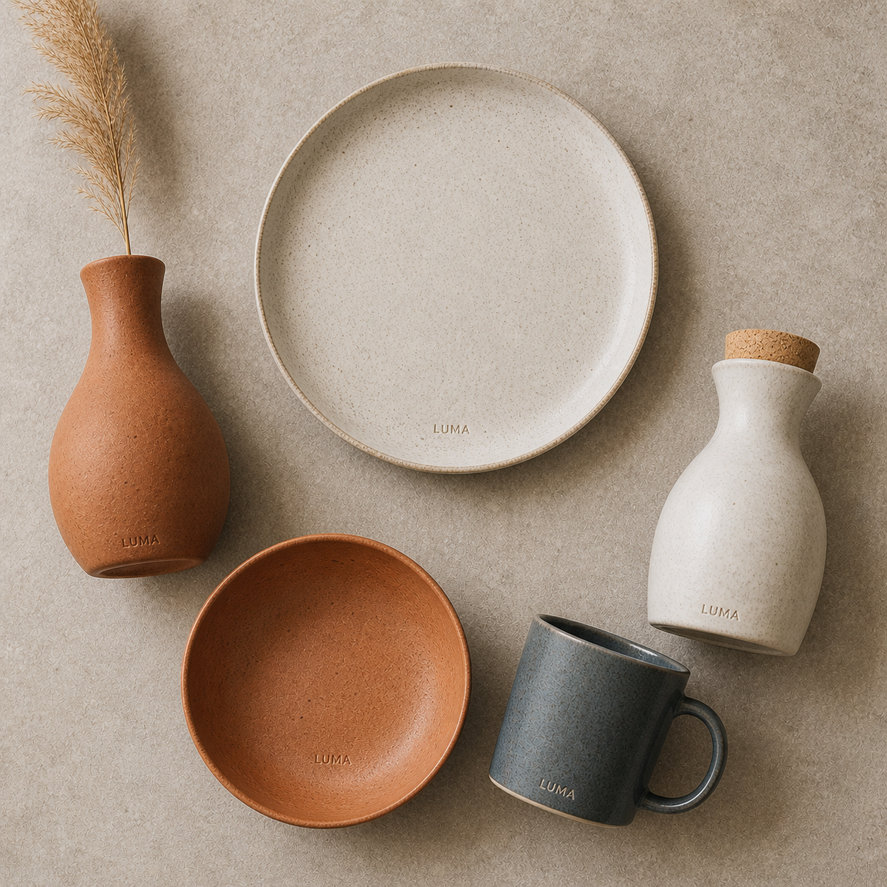
05 — Product System
Five forms, one family
The core range comprises five archetypal vessels — plate, bowl, mug, carafe, vase. Each is produced in two glaze families: Linen (natural stoneware) and Terracotta (iron-rich clay), with a limited Slate series each season. The system is deliberately simple so pieces can be freely mixed.
Dinner Plate
Pasta Bowl
LUMA
Mug · 300ml
Carafe · 750ml
Stem Vase
Dinner Plate
Table — Linen · Terracotta · Slate
Ø 27 cm. Raised lip, light foot ring. Dishwasher safe. Available in all three glaze families.
From €38
Pasta Bowl
Table — Terracotta only
Ø 22 cm, 8 cm deep. Deep enough to hold a generous portion. Terracotta glaze only — a studio favourite.
€34
Mug · 300ml
Daily — All glazes
Cylindrical form, generous handle. Stamped LUMA base. The most-gifted piece in the collection.
€28
Carafe
Table — Linen
750 ml. Cork stopper. Linen glaze only — the pale surface shows the water's movement beautifully.
€62
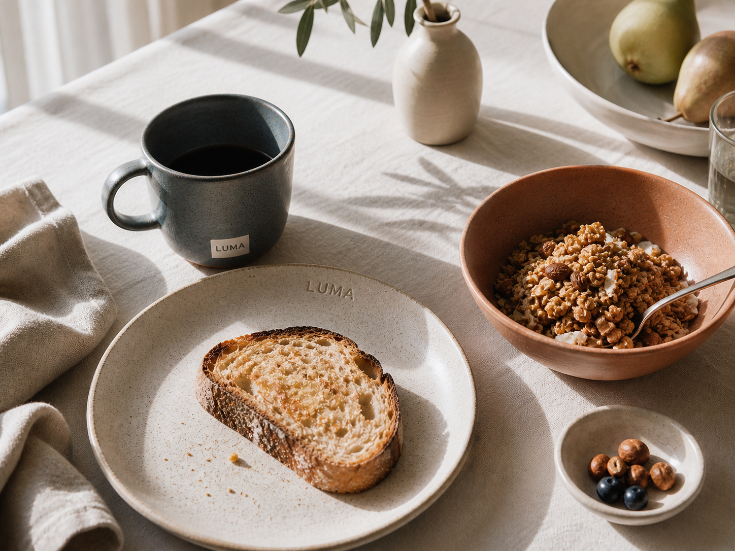
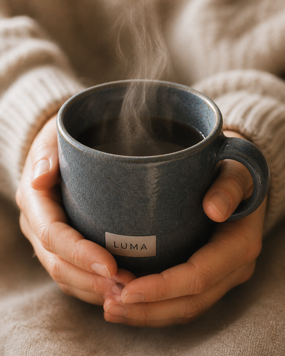
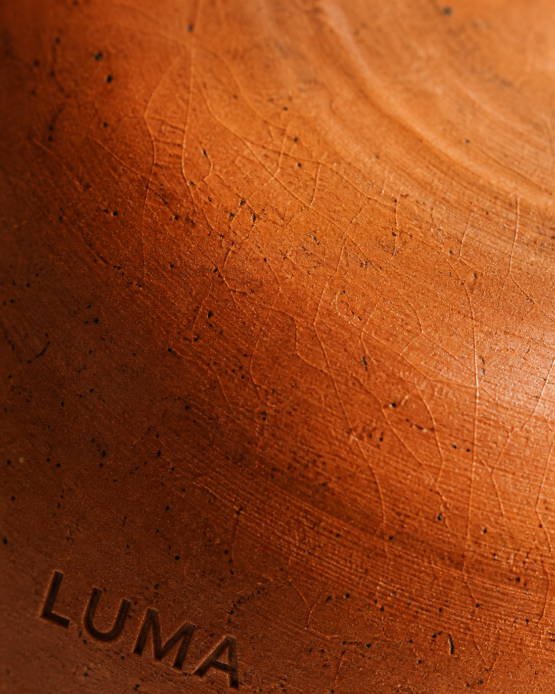
06 — Campaign
Morning light, slow table
The launch campaign, "A Good Morning," was shot in natural light only — no studio flash. Every image shows a piece in mid-use: a bowl with remaining granola, a mug held with both hands, a carafe with sunlight passing through the water. The message: these objects earn their place by being used.
luma-hero.jpg
luma-flatlay.jpg
luma-hands.jpg
luma-texture.jpg
"Objects don't have to be precious. They just have to be good."
— LUMA, A Good Morning
07 — Results
Quiet launch, lasting presence
The LUMA identity launched across e-commerce, wholesale, and three independent concept stores in Amsterdam, Copenhagen, and Milan. The restrained visual system translated effortlessly across digital and print touchpoints, building strong organic recognition within the first quarter.
4×
Wholesale Enquiries
in Q1 vs. projected, driven by campaign imagery shared organically
94%
First Collection Sold
within 6 weeks of launch across all SKUs
3
Editorial Features
Kinfolk, Hole & Corner, and The Modern House within launch quarter