MOCHI is a Japanese-inspired soft serve and rice cake café bringing everyday sweetness to European cities. The brief: build a brand that feels warm, bouncy, and completely impossible to ignore — from the cup in your hand to the billboard above your head.
The brand draws from Japanese kawaii culture without being childish. MOCHI is for anyone who believes that a small treat can genuinely make the day better — and wants to take a photo of it first.
Brand Idea
"Tiny moments. Maximum joy. Every flavour is a feeling."
Tone
Playful without being childish. Warm without being saccharine. Always on the verge of a giggle.
References
Japanese wagashi · Sanrio for adults · Popup Bagels energy · Odd Fellows aesthetic
Audience
Gen Z and millennials in European cities. They discover brands on Instagram and stay loyal for the feeling, not just the product.
02 — Mascot
Meet Mochi.
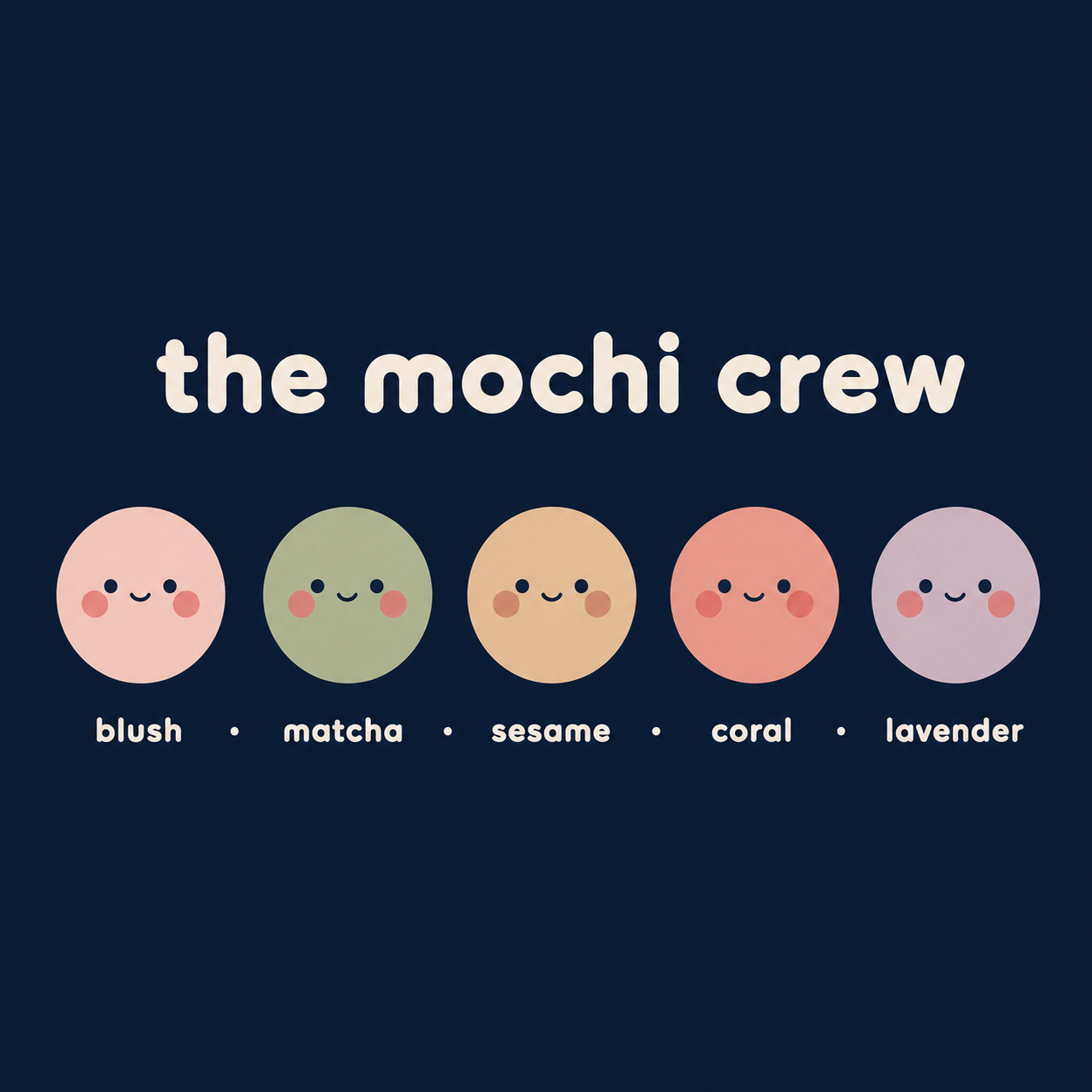
Every great café has a character. MOCHI's is named Mochi — a squishy, round, perpetually delighted little creature who comes in five flavour personalities. Mochi appears on cups, boxes, social media, and staff aprons. No matter the context, Mochi is always the friendliest thing in the room.
Mochi 🍡
Mochi loves soft serve (obviously), rainy days in a warm café, and making new friends.
They have five flavour personalities — each a different colour, shape, and mood.
Together they are the MOCHI Crew.
Friendly
Bouncy
Curious
Always hungry
Camera-ready
Blush · Classic
Matcha · Wink
Sesame · Shy
Coral · Excited
Lavender · Sleepy
02b — Character Construction
Built from a single circle.
The mascot is intentionally geometric — a perfect circle, two symmetric eyes, blush cheeks at 45°, and a half-arc mouth. Every element is proportionally locked. No matter the scale or medium, Mochi is always recognisable.
Body
Perfect circle · Blush #f2b8c6 · no stroke
Shadow
Soft blush glow · no hard border
Eyes
10px circles · placed at 1/3 height
Cheeks
Ellipse · Coral 30% opacity
Mouth
Half-arc · 30px wide · centered
Grid
Bounding box = 1:1 · 8pt unit system
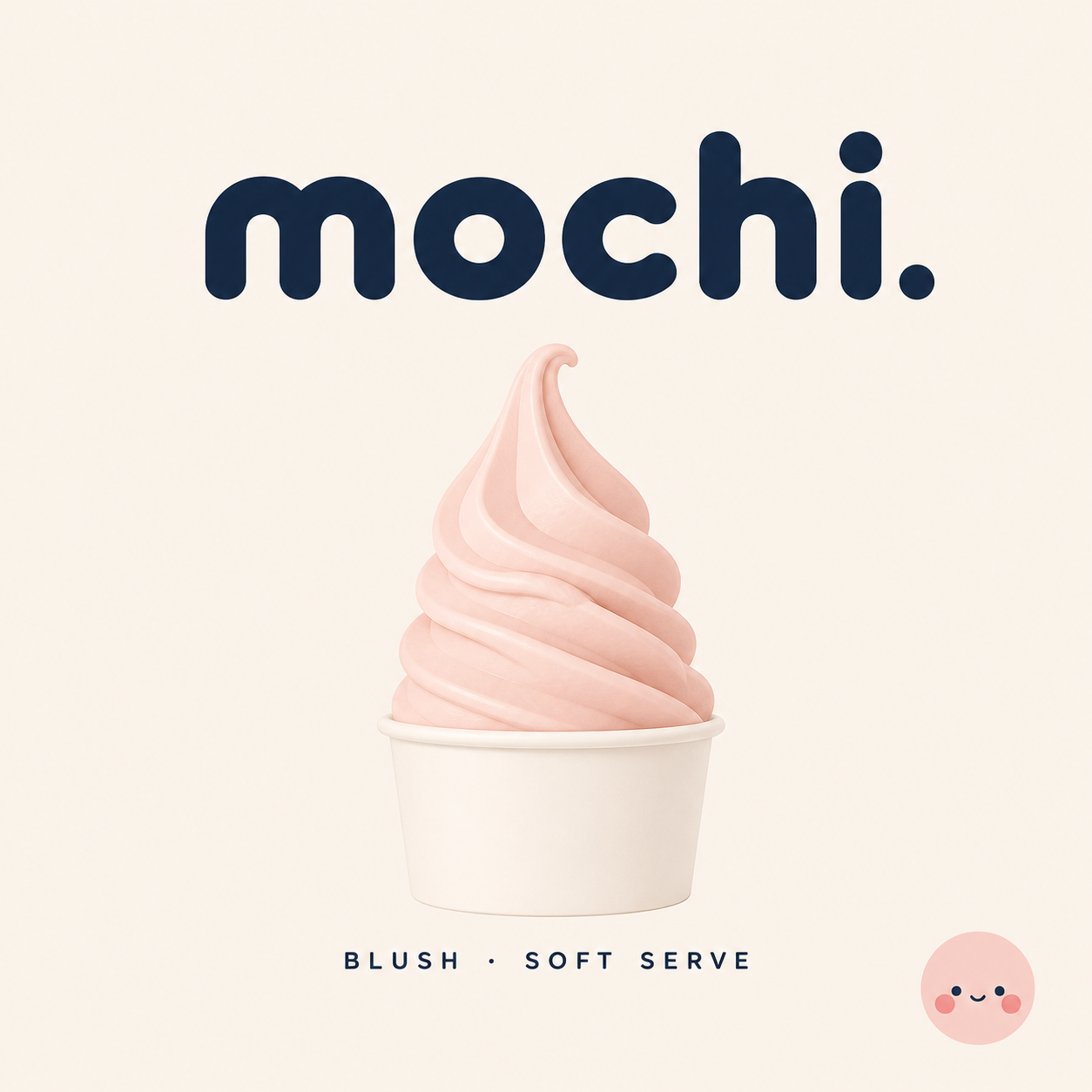
03 — Wordmark
Round, warm, unmissable
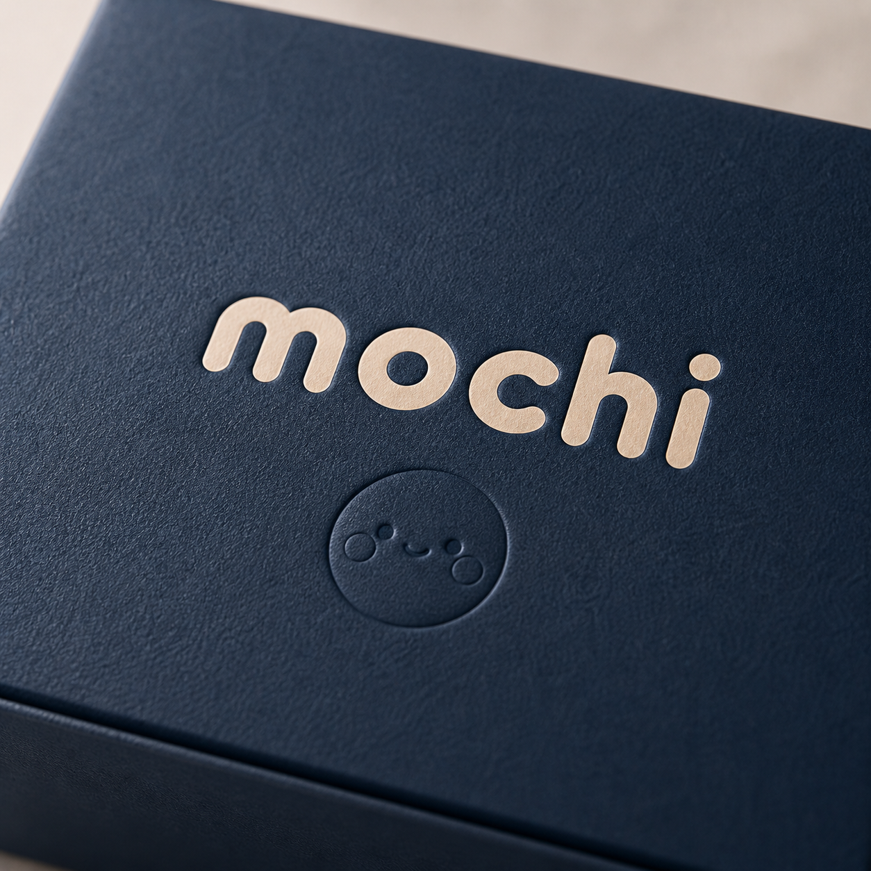
The MOCHI wordmark is set in Fredoka — a rounded display typeface with the same soft warmth as the product itself. Lowercase only. The "c" picks up the coral accent, echoing the brand's playfulness without being loud about it.
mochi
Japanese-Inspired Soft Serve & Café
mochi
Light version — packaging & bags
mochimochimochimochi
03b — Logo System
Clear space. Consistent scale. Always readable.
The wordmark has three approved lockups and strict clear space rules. It is never stretched, outlined, or rotated. The coral "c" is a brand signature — it must always be present in primary uses.
Clear Space
mochi
↔ x-height clear on all sides
Approved Lockups
Primary
mochi
Compact
mochi · soft serve
Tag
mochi
Don'ts
mochi
Don't stretch
mochi
Don't outline
mochi
Don't rotate
mochi
Don't use on low contrast
mochi
Don't track out
04 — Colour
Five flavours, one palette
Each brand colour maps to a mascot personality and a product flavour. The cream and navy serve as the brand's calm anchor — everything else is permission to celebrate.
Cream
#faf6f0
Navy
#1a2332
Blush
#f2b8c6
Matcha
#4a7c59
Sesame
#c4a882
Coral
#e85d4a
Lavender
#c5b8e8
05 — Typography
Round letters, big feelings
Fredoka holds all display and headline work — it's warm, bouncy, and unmistakably MOCHI. Syne handles labels, navigation, and secondary hierarchy. Instrument Sans is reserved for body copy where readability is essential.
Syne · 700 / 800
Labels, menu items, social captions
All-caps with wide tracking
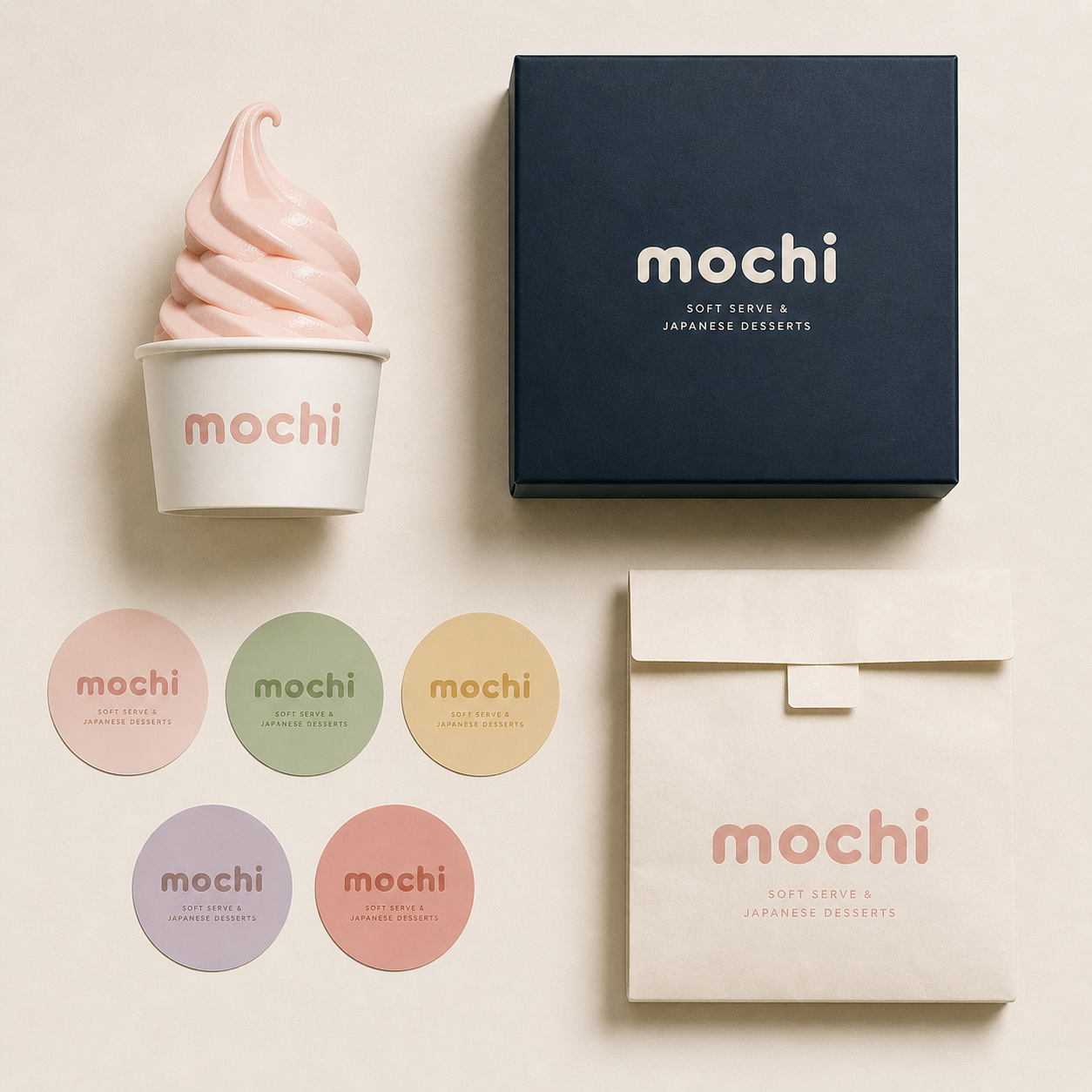
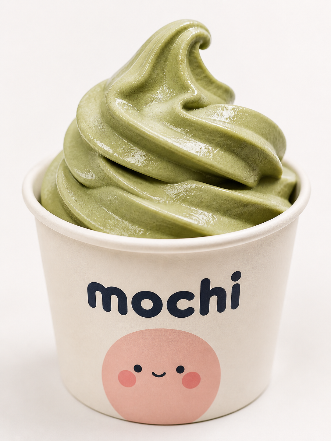
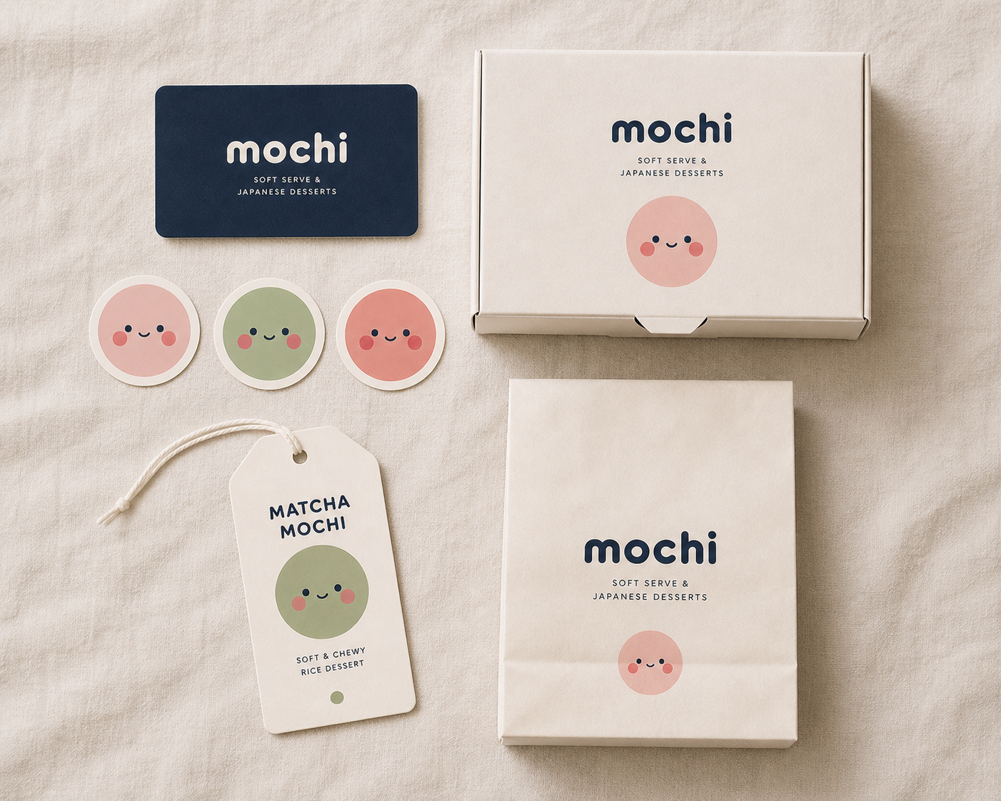
06 — Product System
Everything is a canvas
From the soft serve cup to the gift box to the tote bag — every MOCHI touchpoint carries the same warm energy. The mascot appears on everything, always in the flavour that matches the product.
Blush Soft Serve
Matcha Soft Serve
Sesame Soft Serve
Gift Box · 12 pcs
mochi to go
Canvas Tote
mochi matcha latte
Matcha Latte Can
Soft Serve
Signature · 5 flavours
Smooth, dense soft serve in Blush, Matcha, Sesame, Coral, and Lavender. Served in branded cups or cones — Mochi character on every cup.
From €4.50
Classic Mochi
Traditional · Rice cake
Hand-rolled mochi rice cakes, made fresh daily. Sold individually or in gift boxes of 6 or 12. Each flavour has its own character stamp.
€2.50 / piece
Matcha Latte
Drinks · Hot & iced
Ceremonial-grade matcha, oat milk, served hot or iced. Also available in Strawberry and Sesame varieties. Branded cups, sticker lids.
€5.50
Gift Box
Merch · 6 or 12 pcs
A curated selection of mochi rice cakes in the full flavour range. Pink gift box with navy ribbon and Mochi character tag. The ideal present.
From €16
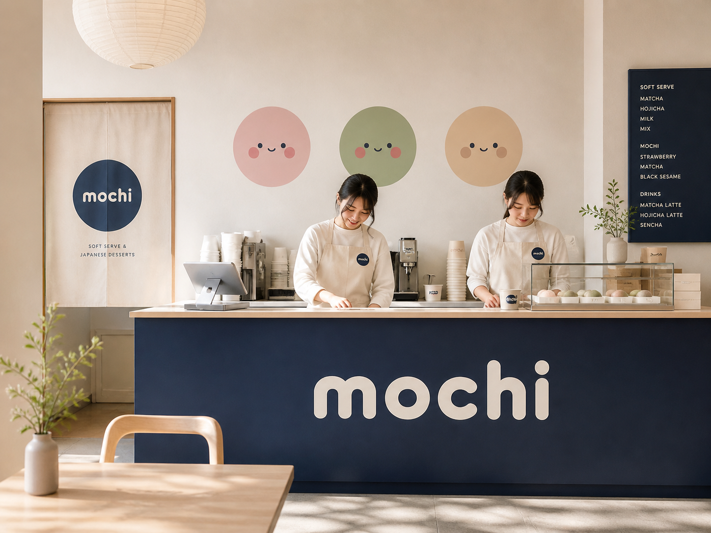
06b — Brand Applications
The brand on every surface.
Every touchpoint follows the same visual logic: cream or navy background, Fredoka wordmark, mascot at scale. Below are four key application contexts showing how the identity translates across materials.
mochi
Soft Serve Cup
mochi
Staff Badge
mochi
Gift Box · 12 pc
mochi to go
Canvas Tote
07 — Campaign
Give yourself a tiny moment
The launch campaign, "Tiny Moments," ran across Instagram, outdoor, and in-store. Every image was shot with natural light and soft, airy styling — products in mid-enjoy, never posed. The tone: come as you are, have something sweet, leave a little happier.
mochi-hero.jpg
mochi-softserve.jpg
mochi-cafe.jpg
mochi-flatlay.jpg
Give yourself a tiny moment.
— MOCHI, Tiny Moments Campaign · 2024
mochi-social-1.jpg
@mochicafe
blush season is here 🌸 which flavour are you?
mochi-social-2.jpg
@mochicafe
matcha hour starts now ☘️ see you at 3pm
mochi-social-3.jpg
@mochicafe
gift box restocked 🎁 12 pcs of pure happiness
08 — Results
Joy scales quickly
MOCHI launched with a single Amsterdam location and a social-first campaign. Within three months the waitlist for the gift box had grown to 1,200 people, and two more locations were confirmed for Rotterdam and Berlin.
1.2k
Gift Box Waitlist
within 6 weeks of launch, before second batch production
280k
Instagram Reach
in launch month — 94% organic, zero paid media
3×
Locations in 6 Months
Amsterdam · Rotterdam · Berlin — all driven by social demand