Écrire, c'est exister. A complete brand system for a French fine stationery house.
ScopeBrand Identity
ScopeStationery System
ScopeArt Direction
TypeFictional Brand
01
Brand Concept
The art of slow correspondence
PLUME is a Parisian fine stationery house founded on a single belief: a letter, properly written, outlasts everything. In an age of instant messages and disposable communication, PLUME makes the act of writing a deliberate, sensory ritual — weighted paper, botanical inks, hand-poured wax.
The name "Plume" is French for feather — the original writing instrument, and a symbol of lightness, precision, and the intimate relationship between writer and page.
Positioning
Heirloom quality
Not luxury for display — luxury for use. Paper you want to write on, envelopes you want to seal, notebooks that feel like a promise.
Audience
The deliberate writer
30–55, cultural, romantic. They still send handwritten notes. They keep letters. They believe in the weight of the written word.
Tone
Intimate and precise
Not nostalgic. Not twee. PLUME is quietly confident — the tone of someone who writes a beautiful letter and expects it to be read slowly.
02
Visual Identity
The wordmark
The logotype is set in Playfair Display Italic 900 — a typeface with strong editorial roots and visible calligraphic influence. The italic angle introduces movement, as if the word itself was written by hand. Below it, "Papeterie de Luxe · Paris" anchors the brand in place and craft.
Plume
Papeterie de Luxe · Paris
Plume
Encre / Dark
Plume
Bordeaux / Brand
Plume
Crème / Light
03
Color Palette
Ink, velvet, candlelight
Five colours, each named in French. Encre and Bordeaux carry authority. Rose poudré brings softness without sweetness. Or ancien adds warmth — never flash. Crème is the canvas everything rests on.
Encre
#1A1410
Bordeaux
#4A1528
Rose poudré
#C4899A
Or ancien
#B8952A
Crème
#F5F0E0
04
Typography
Serif leads, sans follows
Playfair Display carries all the romance — headlines, wordmark, pull quotes. Its high contrast and calligraphic DNA connect directly to the quill. Instrument Sans handles all functional copy — addresses, specifications, captions — keeping the system legible at small sizes.
Playfair Display
Brand serif · Headlines · Wordmark · Pull quotes
900 ItalicÉcrire, c'est exister.
700La lettre est un art qui ne meurt pas.
400 ItalicFine stationery, made to be written on.
400 RegularPapeterie de Luxe · Paris
Scale — brand materials
DisplayPlume
H1 · 28pxLa lettre parfaite
Body · 16pxHandcrafted in Paris since 2024.
Label · 11px90g · Cotton rag · Made in France
05
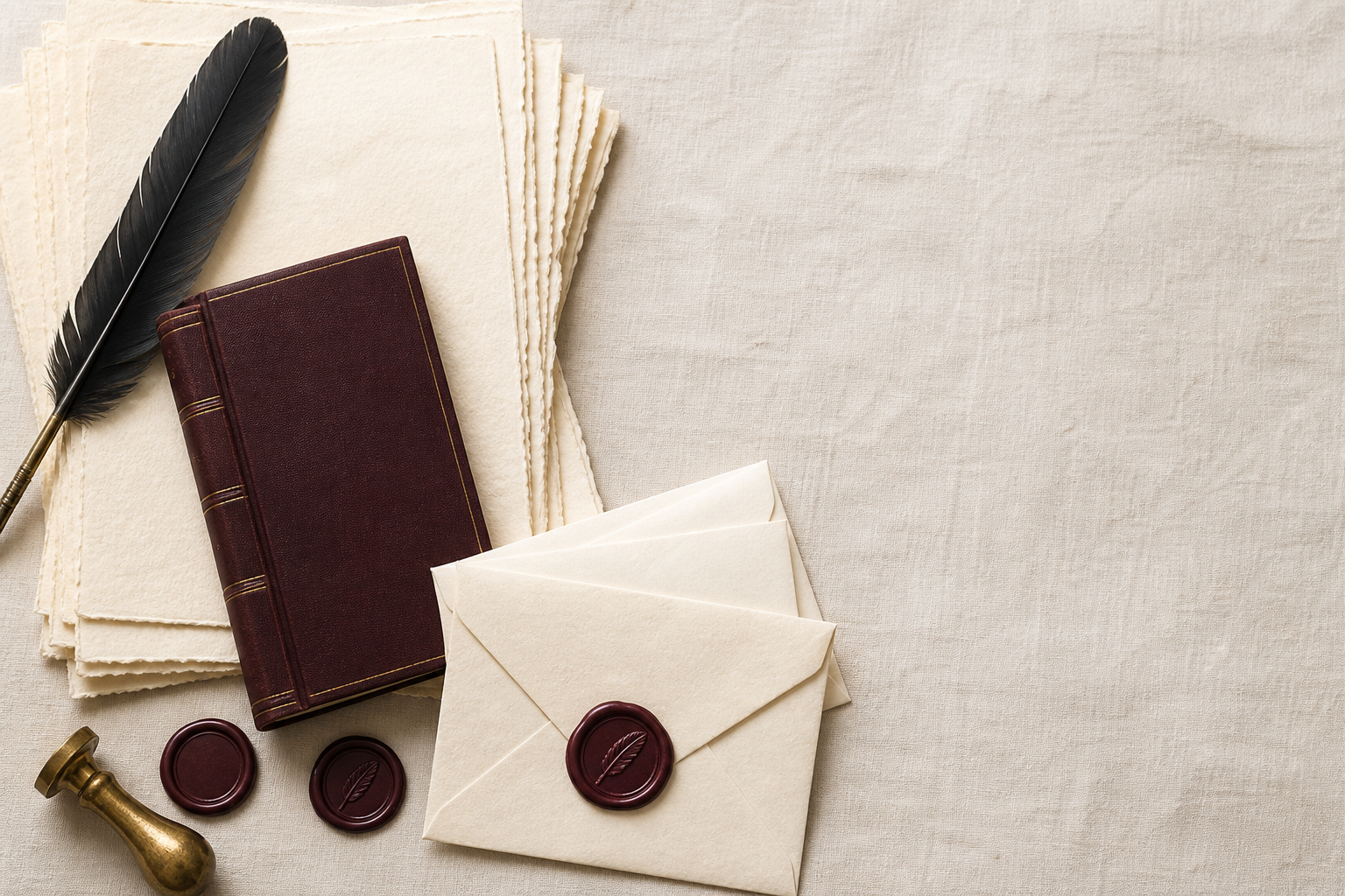
Product System
The collection
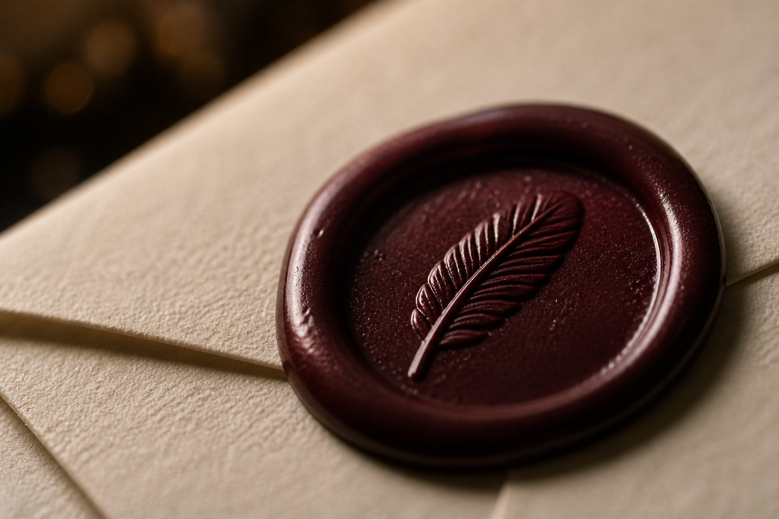
Four objects, one language. Lettres — 90g cotton rag paper, deckled edge. Enveloppes — lined with marbled paper, sealed with burgundy wax. Carnets — bound in cloth, spine in gold foil. Cachets — hand-poured wax in a monogram mould.
Plume
Lettres
P
Enveloppes
Plume
Carnet
Carnets
P
Cachets
The full collection — Lettres, Enveloppes, Carnets, Cachets
06
Art Direction
Campaign direction
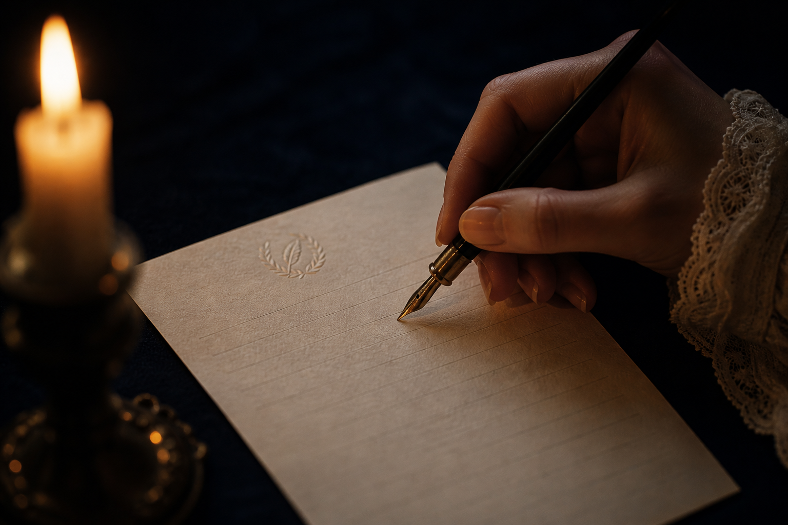
The campaign lives in the hour just before dark — l'heure bleue. Candlelight, ink stains, half-written letters. The feeling of intimacy, not performance. All photography is staged as if we interrupted someone in the act of writing.
Photography
Candlelight & shadow
Single candle, warm rim light, heavy shadow. Products placed mid-use — ink open, pen resting, seal still warm. We interrupted something private.
Copy tone
One line, in French
"Écrire, c'est exister." Copy is sparse, poetic, never descriptive. The image carries the meaning; the line just confirms it.
Colour grading
Amber warmth, cool ink
Warm candlelight in the shadows; cool blue-grey in the highlights. The paper glows. The ink stays dark. Everything else falls away.
Texture
Paper grain everywhere
Visible paper texture in every shot — under the products, in the background, on screen. The brand lives on paper. Photography should feel like it too.